Friday, May 29, 2009

Tree of Life - how a painting is born, part 4

now my sketch is pretty much ready to receive its first watercolor wash. so let's start with an underpainting on the background, which works very well to help me define a pallete for my piece. it's easy to get crazy with so many colors in front of you and wanting to experiment and mix and create a color extravaganza, but better take it easy. I try to limit my pallette the most possible so I won't get overwhelmed and get into more problems to solve.

this panel is all about life, fertility, joy. is intended to be "springy" and vivid, so I choose warm and jovial colors that will work as a basis for the work: dioxazine violet, rose madder and cadmium yellow. I start applying pure water on the area I want to fill, with just a little bit of pigment so I can see where the water is going. then I aplly each one of the three chosen colors freely with the bamboo brush and a flat brush, letting the pigments run with the water and mix.


this is how it looks like after the wash is done and still fresh (please forgive my lamp light reflecting on the wet surface.) I love to move the board while it's still wet and make the colors migrate across it and blend with the others, creating all kinds of dreamy effects.

now it's time to wash my dishes and grab a coffee and let the painting gets dry.

Thursday, May 28, 2009

Tree of Life - how a painting is born, part 3

after several studies in my sketchbook, I finally got tired and decided to go for action. you can't waste a lot of time in studies, or you'll go nuts. to find the perfect images it's an illusion, for you'll evolve, change your tastes and style. if you spend too much time looking for perfection, you'll never complete a work. besides, the final result will never match exactly what you've planned. things go changing as long as the colors come; you add something here, you take something there, you'll never know what you are going to face when you go for the canvas or paper sheet adventure.

as I am doing a quasi "painting reality show" here, I thought that would be a good thing to talk a little about the materials I am using for this work. my support this time is the beloved illustration board.


that's what I use when I'm working on more complex stuff. my brand of choice is Crescent, which is an affordable good quality stuff. it's just perfect for the ones who use tons of pigment and hundreds of watercolor layers, which would deform any regular paper. another advantage: the board stands the most hardcore techniques, specially when you need to lift the pigment off after making a mistake or getting an unsatisfactory result and want to do it again.


on my side table I have Winsor & Newton watercolor tubes and pans, number 00 to 5 round brushes, flat brushes for washes and my precious Chinese bamboo brushes; two jars of clean water, pallete, pencils, mechanical pencils, stumps and different types of erasers; and my best friend, the paper towel.

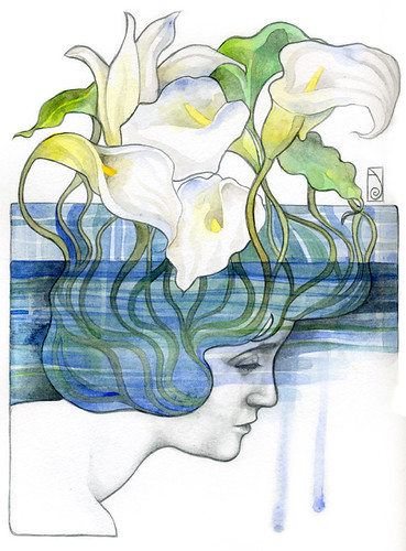
I start adding new elements to the sketch...

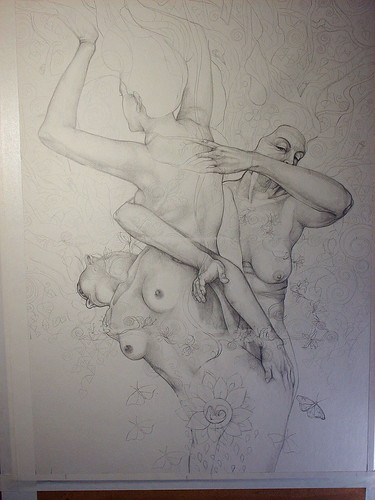
... a fetus on the basis figure, right on the womb. the lower triangle vortex points right there - manifestation of the Divine in the physical plane. a spiral shapes the form of the womb and fetus - the golden spiral of the Sacred Geometry, symbol of the Cosmos harmony and precision. the womb is surrounded by a wide petals flower, which will possibly be a lotus, I still don't know. from the flower drops run down toward the ground - which I'll represent in one of the adittional panels, now named South panel, below this one, which is the central panel. a curious thing: I draw the drops without realizing that they are pointed downward, as if they are coming from the ground, and not the opposite, as they are supposed to be. that reminds me some images of the XVIII tarot arcane, The Moon, in which the Moon itself seems to be sucking drops out of the ground. since the South panel will bring a representation of the Moon, I have the impression that more stuff will arise from that!


... branches, leaves, abstractions, spirals, spirals.

now it's time to solve the problems that appeared since the work took a different direction. as I started to have different ideas when the main image had already been built on my definitive support, I have to make some adaptations ou I'll have to redo the drawing. but the thing reveals not as hard as I thought it would be.

problem 1 - composition of the six-pointed star. after several calculations the star ends up fitting well the work, although its sides are not that exact. but that's not a problem, since the difference is not so perceptible. to solve the visibility of the star, I decide to build the triangles that form it using spirals and flowers, giving to it an organic quality that harmonizes with the object (tree) and dispenses the mathematical precision. I think that in the picture below you can have an idea (I intensified the contrast to turn visible the lines that form the triangles, still too light. they are traced over the figures.)


problem 2 - placement of the triangles in the center of the picture. the star needs here to be more or less centralized, in order to bring balance to the composition. I can't do it without deforming the triangles; then, the solution I find is to eliminate one inch on the left of the painting. I stick some tape to delimit my working area. in order to do not have to get my board off the wooden one that works as a support, I decide that I'm going to cut the painting off after it's done, which is dangerous because if I make some mistake in the cut, bye bye painting. but since I've done that before with no problem at all, I am confident that everything will be alright this time also (gulp!)


extra tape stuck toward the right, marking one inch less on my working area.

the final touch before starting the watercolor is to age one of the women. I want to give to the figures that Triple Goddess character I've mentioned before - Maiden, Mother and Crone. I pick the one at the right, that since the beginning looks older than the others. it's curious how she is the only one who shows more of her own face.


work in progress: Tree of Life

work in progress: Tree of Life

the final work, before the watercolor:

work in progress: Tree of Life

Monday, May 25, 2009

interview on Abbey of the Arts

wow, I am soooo happy with my interview on the Abbey on the Arts! many thanks to sweet Christine for being so respectful and kind. check it out!

Sunday, May 24, 2009

the zodiaque series

I've just started a series inspired in the twelve signs. the first one is Gemini (my own sign), and it's already done (picture of the process below.) now I am working on Scorpio. when it's done I'll scan both and publish them. they are all intended to have a certain Japanese feel, with faces wearing that geisha make-up I love, and very fluid abstracts surrounding them.

I really enjoy to have several projects in hands, so I can pass from one to another according to my inspiration and mood (very Gemini indeed.) and those quick painting are a great way of exercising and defining stylistic elements.

Thursday, May 21, 2009

Tree of Life - how a painting is born, part 2.1

a thing I have just noticed in the study in my skechbook: the triangle pointed downward points out just to the figure's tummy, at the basis of the tree. womb. look what a beautiful thing: the manifestation of the Divine Spirit in the generation of a living being in the physical world (man, I am totally sensitive to all these babies and maternity stuff and all their spiritual connection, felt like crying now.) I now have material for a different work!

Luís, a friend from Portugal, left a comment in my blog in Portuguese that it worth to be responded in the form of a post, soon. another beautiful idea came as a wonderful image that dearest Dee sent me by email yesterday, which is part of the new Lars Von Trier film, Antichrist:

Tuesday, May 19, 2009

Tree of Life - how a painting is born, part 2

on the day before my trip I was a little obsessed about the Tree of Life. I was feeling a little blocked - maybe because I was so tired and my eyes were hurting and feeling heavy. but I decided to start a quick research about the subject, since my knowledge about trees of life was a bit too generic. I could realize how complex it is, though, since there are myths about trees practically in every culture of this world.

working with myths is a treacherous field. the further you go studying them, the more excited you get to see how things unfold and relate to others, mainly inside yourself. ideas start to pop out from everywhere and you end up getting lost and frustrated because it's simply impossible to put everything in a painting. better take it easy, starting from the basics and hear your inner voice.

the Tree of Life is basically about how all the creatures' existence is intertwined and tied to this big net called Universe. microcosm and macrocosm together, skies and earth. looking at my rough study sketch, I notice that my figures composition is a triad - Virgin, Mother and Crone? - and that their heads make an almost perfect triangle.


I add to it another one, pointed downward. the Seal of Salomon, spirit and matter, macrocosm and microcosm, as above so below. if I had planned it, it wouldn't be so perfect.

so now you can see how crazy might be all this thing of creating art. this is why most of time I don't despair when I feel blocked. I know that the work (?) will point out the directions by itself, and things sooner or later fall into place.

I have a problem, now. I just found out the six pointed star in the sketch when I already had the definitive penciling done. and on the board the heads are not that aligned, the symmetry of the triangle is not the same. it would be kind of crazy to reject the first work and doing another one, more "into the rules" - even why, a second similar work is never like the first one. it might be better, or worse. I don't want to risk. I stick with the first, and accept the challenge of creating a pictorial solution that suggests, or simulates, the triangles.

another problem: the "tree trunk" is occupying more than 60% of the board area. ok, the three women are nice and all, the composition is attractive enough, but it's a Tree of Life, and it has to have a big, luscious canopy.

the solution comes in the form of additional panels, one at the top and one at each side. I like the idea, it will look like some kind of puzzle. nice, nice. and in each panel, what about to represent one of the four elements, or the four seasons? the four seasons are a perfect symbol for the cycle of life.

I look for images of Trees of Life around the web. I find many ones with branches and limbs in the shape of spirals. I paint a lot of spirals, but I wanted something different just because spirals are a kind of cliche for trees of life, and we must run away from cliches whenever we can. but... spirals are symbols of life! they represent cycles, evolution, fertility. the spiral is one of the oldest representations of the Goddess power. Klimt probably knew very well what he was doing when he painted his famous and beautiful Tree of Life. how could I run away from that?


but I want more in each one of the panels. I want more symbols, not only birds, fishes (I love fishes in unusual places) and mammals. I am now exploring a little of Kabalah and trying to find relations between its tree and mine. I know almost nothing of Kabalah and never could take the time to study it, so now I think I'm before a good opportunity to understand it a little.


Studies for birds.

Sunday, May 17, 2009

clean.

I'm back from my short trip. I guess.

first action: to change the blog's layout. tired of that dark color, nothing like something clean. it seems like my thoughts can breath now.

be right back.

Sunday, May 10, 2009

she's my masterpiece


hope you all have had a wonderful Mother's Day, like mine.

I'll have no internet connection for a few days. be back next week, hopeful with some new stuff to show you all.

Friday, May 8, 2009

Tree of Life - how a painting is born, part I

I decided to give me a more prolonged break from the the triptych and work in a different project. since I had planned to submit a piece to the beautiful Embracing Our Differences exhibit, I decided to start working on it. I thought that it might be also a good opportunity to show in more details how I create and build a picture - and how crazy and erratic the creation process can be.

the image submitted to the exhibit should not be very complex, but rather transmit the idea of acceptance and tolerance of the differences in a direct way. sometimes it's not easy for me to think simple, I have a certain knack for complexities - but not exactly because I plan them. then I had the idea to make a group of androgynous figures of different colors emerging from the ground. the figures should not show in their bodies nothing that could resemble race, or genre. the colors should be regular ones, like red, green and yellow, for example, and not skin colors. the intention is not focus in a special subject. the concept was to remind that we all are equal for we all are born the same way as children of the Earth and we all will die the same way and come back to Her.

when I still don't have an idea about what I want to paint, I usually feed my mind with pictures, videos, and music. usually my search doesn't last too long. I'm very imaginative and sometimes just a single vision of patterns in the wings of a bird, beautiful draperies or an unusual sunset sky are enough to inspire me with colors and shapes. and when I want to put a group of figures in the picture, I first need to do some study until finding a good, harmonic composition. I go to my collection of reference pictures, open my Photoshop and start to pick pictures and position them until find a composition I really like. usually it's when the real job starts and when more ideas arise. sometimes, the next step is to transfer the image in a very rough sketch to my sketchbook and start creating. other times, when I have a clear idea of what I want, I go right to the illustration board. the image is still blurred in my mind, so I'd better do some studies first.

in the sketchbook things start to change. first, I suddenly realize that the intertwined figures look better with their breasts. the initial idea begins to crumble. second, I begin to see branches coming out the arms and hair. the group of figures is now a big tree.

ok, we can use a big tree to represent structure, for example. differences structure the world, make it a most interesting and rich place. but now the figures have a genre, they are women. I'm afraid that my initial idea is now getting more and more dissolved.

now I don't know what to do with a big tree which trunk is made of three women intertwined. but I love the idea, and I want to continue on. but it's no longer a project for the Embracing the Differences exhibit. it's something else I don't know what is.

the word came to my mind all of a sudden: Tree of Life.

eureka!! what could be more appropriate for a tree of life than a tree made of women? I was in awe. almost immediately I started to sketch the figures on the board, using 2H and HB pencils.


little branches coming from fingers...

this is why I say that many times our creations don't really belong to us. they seem to have a life of their own. no matter what we plan for them, in their way to completion they may end up turning out something totally different. we artists are just the channel.

I finished the penciling today, or at least what I call the "basics". at the end of the process I'll fix what I judge to be flaws and enhance the shadows using a softer pencil (usually 2B or even 4B, but nothing beyond that.)


now it's time for the fun to start. in the next step I'll create the abstractions and define the branches, leaves and the other elements I want the tree to have. I confess I am still not certain of what to put in the tree besides animals and birds. a Tree of Life is something big and deserves to be well thought about. let's see what kind of insight I'll be granted with in the next days.

Thursday, May 7, 2009

"The Chemistry" in Australia

last weekend the mailman left me something from Australia...


The Small Tapestry is a newsletter issued by the Pagan Awareness Network to all their members. it's very well done and informative. the Autumn edition is bringing my piece "The Chemistry" on its cover. thank you Veronica and PAN folks, I loved it!

Monday, May 4, 2009

business cards, chinese brushes and the meaning of life.

my business cards arrived today, and I am again very impressed with the quality of the job delivered by PsPrint (no, I'm not gaining anything for marketing them, I just think that a good work deserves to be spread.) the only negative thing was entirely my fault: I think that my data got too small and too light, and sort of lost amidst the art. sigh.

again, my camera and its "wonderful" macro don't make justice to the stuff, but you can have an idea. I wanted that the card could show samples of my work, them I used details of some paintings on the color side and my now sort of symbolic dragon on the black and white side, along with my name, email and website address.

here are the file samples (with bleedings):


+

and seriously, how could I live for so long without Chinese bamboo brushes?????


they are designed for sumi-e painting, and provide such a fluidity to the lines that makes them appear lighter and with more movement. I totally recommend those brushes if you are into a lot of spirals, waves and ornamental patterns, like I am. they are also cheaper than regular brushes and hold a lot of pigment. just one thing turned me off, I think that the brush "body" or holder is not that strong, it appears that you have to be a little more careful when using it, or it may break apart. but that's probably a matter of brand, I'm not sure. anyway, I'm happy with my new set of Chinese brushes and can't wait to explore their possibilities.

LinkWithin

Related Posts with Thumbnails